
If you've ever spent twenty minutes toggling between fonts, wondering if it actually makes a difference, you're not alone. After all, it's one of those questions that feels almost too simple to ask.
Typography does heavy lifting you might not notice. It sets expectations, signals your market position, and helps customers decide whether you're the right fit. The good news? You don't need a design degree to make smart font decisions. You just need to understand what's happening beneath the surface.

How Do Font Choices Affect Customer Perception?
First impressions happen fast. Research suggests we form opinions about a brand within milliseconds. Before your tagline registers, your typography has already spoken.
Specifically, your font choices trigger subconscious associations. A traditional serif font communicates establishment and trustworthiness. A clean sans-serif feels contemporary and approachable. Meanwhile, script fonts suggest personality and elegance.
When your font doesn't match your brand personality, it creates cognitive dissonance. Your words say one thing, but your typography says another. Customers might not articulate why something feels "off," but they'll sense it.
Take Chupi, the Irish jewellery brand. Their elegant script typography reinforces everything their brand represents: handcrafted, personal, luxurious. Imagine that same brand using a blocky, industrial font. The disconnect would be immediate.
What different font styles typically communicate:
Serif fonts (with small decorative strokes): Traditional, established, trustworthy
Sans-serif fonts (clean, no decorative strokes): Modern, approachable, straightforward
Script fonts (flowing, handwritten style): Personal, creative, elegant
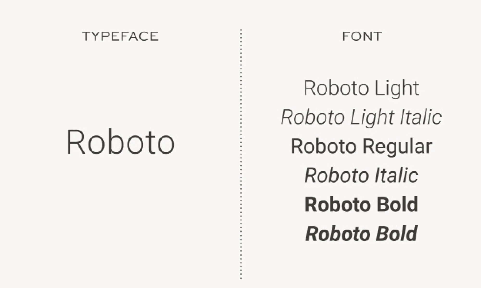
What's the Difference Between Fonts and Typefaces?
This trips people up, but it needn't.
A typeface is the overall design family (like Helvetica). A font is a specific variation within that family (Helvetica Bold at 12 points).
In everyday conversation, most people use these terms interchangeably. That's perfectly fine. What matters isn't the terminology—it's choosing typography that works for your brand and using it consistently.
How Do I Make the Right Font Choices for My Brand?
Making good font choices doesn't require design expertise, but it does require honest reflection.
Start with your brand personality. If you described your business in three words, what would they be? Bold and energetic? Calm and reassuring? Your typography should visually echo those words.
Consider your audience. What do your ideal customers expect from businesses in your industry? For instance, a solicitor's firm and a children's party supplier have very different customer expectations.
Test across contexts. A font that looks beautiful in a heading might become illegible on a business card. Therefore, check how your typography performs across your website, social media, and print materials.
Gym+Coffee gets this right. Their bold, friendly sans-serif matches their inclusive, energetic positioning perfectly. It works on shopfronts and tiny Instagram captions alike.

A simple framework for evaluating font choices:
Personality Match: Does this font feel like your brand sounds?
Audience Alignment: Would your ideal customer expect this from you?
Practical Performance: Is it readable at every size you'll use it?
One more thing: restraint matters. Stick to two or three fonts maximum. More creates visual chaos and makes your brand harder to recognise.How Do I Make the Right Font Choices for My Brand?
Can the Wrong Font Choices Actually Hurt My Business?
Yes, but probably not dramatically.
In reality, poor font choices cause gradual damage. Inconsistent fonts across your touch-points slowly erode the trust and recognition you're building. Customers might not consciously notice, but your brand feels less cohesive.
Additionally, fonts that clash with your positioning confuse your message. Poor readability costs you directly, especially on mobile, where visitors simply leave if text strains their eyes.
The reassuring part? These issues are fixable, and awareness is the first step.
Do Smart Font Choices Require Paid Typefaces?
Budget matters, especially for Irish SMEs. Here's the honest answer: free fonts can absolutely work.
Google Fonts offers hundreds of quality typefaces at no cost. The key is making smart font choices and applying them consistently, not spending money for the sake of it.
Paid fonts offer distinctiveness and extended licensing as you grow. However, for earlier-stage businesses, investing time in choosing the right free font beats investing money in the wrong paid one.
Where Does This Leave You?
Font choices are brand decisions, not just design decisions. They communicate your personality, set expectations, and shape how memorable your business feels.
Ultimately, you don't need to become a typography expert. Just approach these choices with care: start with personality, consider your audience, and stay consistent.
If you're ready for expert guidance on typography and the visual elements that shape your brand, our visual identity design services are built for Irish businesses navigating these decisions. Fill in a few details below to start the conversation.


