
For Irish businesses, the real question isn't which colours have magic powers. It's whether your colour choices fit your audience, your market, and the experience you want customers to have.

What Does the Research Actually Say About Colour and Branding?
Colour perception is real. Studies confirm that colour affects how we feel about products and brands. But here's what research actually shows: personal taste, cultural background, and life experience matter far more than any "universal" colour meaning.
That statistic you've seen about people making choices in 90 seconds, with 90% based on colour alone? It's been misquoted so many times it's lost all meaning. The original study was about product assessment, not brand preference. And the findings were far more limited than the viral version suggests.
Colour Psychology: Claims vs. Reality
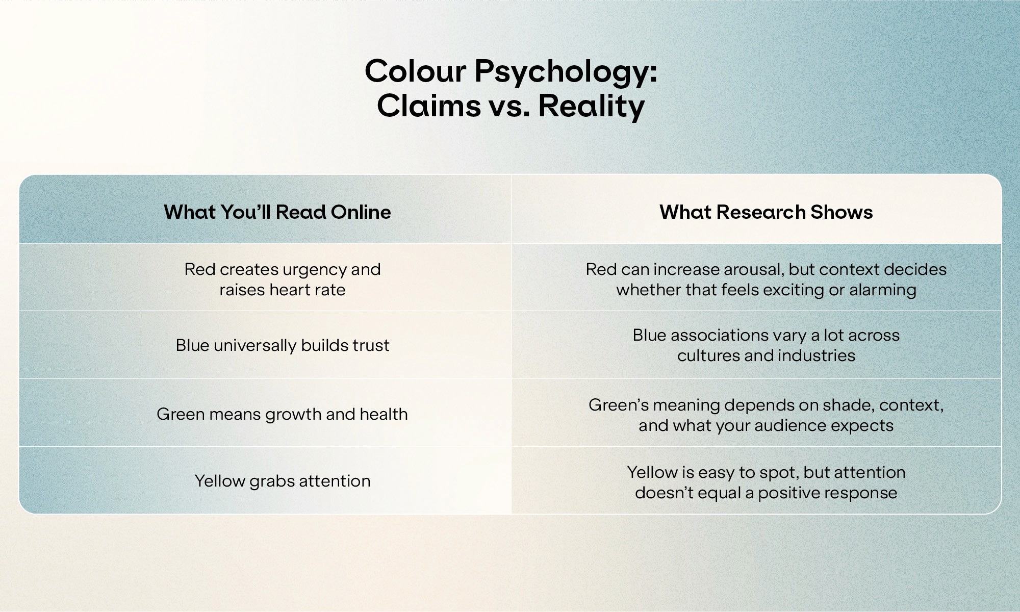
Much of what circulates as "colour psychology" is marketing content recycled without checking. The same unsourced claims appear on thousands of websites, each citing the last. When you trace these ideas back, you often find opinion pieces, not peer-reviewed studies.
This doesn't mean colour is irrelevant. It means the simple rules don't hold up.
Why Do Colour Psychology Myths Spread So Easily?
Simple answers are appealing. When you're running a business, the idea that picking the "right" colour will unlock customer trust or boost sales sounds great. It's a choice you can make quickly and feel good about.
Confirmation bias does the rest. Once you believe blue means "trustworthy," you start noticing blue logos on banks and tech companies. You don't notice the blue logos on budget airlines or discount shops, because they don't fit the story.
The truth? Effective colour choices need strategy, audience insight, and market analysis. That takes effort. A colour chart feels like a shortcut. But shortcuts rarely build strong brands.
How Does Cultural Context Shape Colour Meaning in Ireland?
Green is the obvious example. In Ireland, green carries cultural weight. It signals heritage, connection to place, and a certain pride. But it's also everywhere. If you're launching an Irish food brand and default to green because it "feels Irish," you might blend into a sea of rivals making the same choice.
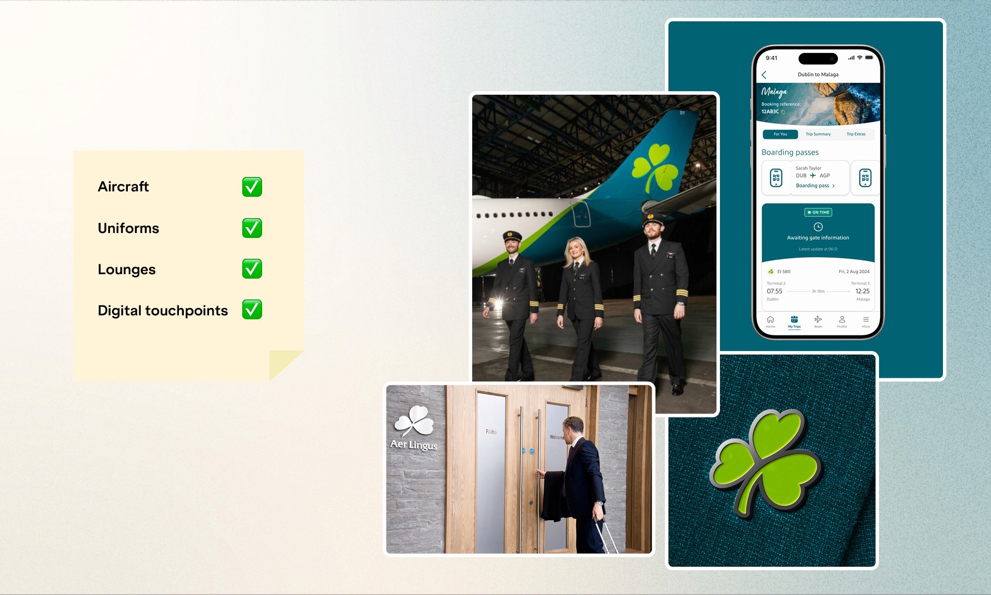
Aer Lingus offers a helpful case study. Their teal green works because it connects to Irish identity while feeling modern and confident. For an airline, those qualities matter. You want passengers to feel they're in capable hands. But the colour alone doesn't create that feeling. It's the consistent use across aircraft, uniforms, lounges, and digital touchpoints that makes it work. The strategy came first. The colour supported it.
Think how the same green might land for a Dublin law firm or a Cork craft brewery. Context shapes everything. Irish consumers respond to quality cues, authenticity, and genuine brands. Colour can reinforce those signals, but it can't create them from nothing.
What Should Irish Businesses Consider When Choosing Brand Colours?
Start with your market. What colours dominate your sector? If every accountancy firm in Dublin uses navy blue, matching them might feel safe. But it won't help you stand out. On the flip side, if your whole industry uses bold colours and you choose muted tones, you'll need other ways to grab attention.
Think about practical use. That beautiful gradient might look stunning on screen but print badly on business cards. That pale yellow could vanish on a sunlit shop window. Colours need to work across every touchpoint: website, social media, print materials, signage, packaging, and physical spaces.
Staying consistent matters more than being perfect. A "good enough" palette applied strictly across every customer interaction will beat a "perfect" palette used loosely.
Questions to Ask Before Choosing Your Brand Colours:
What colours do your main rivals use?
What feeling do you want customers to have when they meet your brand?
Will this palette work across all your touchpoints?
Does this choice reflect your brand's personality and values?
Can you commit to these colours for years to come?
When Does Colour Strategy Require Professional Support?
Some businesses can make confident colour choices on their own. Others benefit from working with a visual identity agency that treats colour as part of a larger strategic system.
At BrandNew Creative, we approach colour as a strategic choice, not a creative whim. After more than ten years working with Irish SMEs across retail, hospitality, and professional services, we've seen how colour choices play out in practice. The question isn't "what does blue mean?" It's "what does your audience expect, and how do you want to position yourself in your market?"
Colour choices flow into brand guidelines that ensure consistency across every use — from marketing collateral to corporate identity materials. When colour choices are made with strategy and documented well, your brand looks intentional rather than accidental.
What Brand Colours Really Mean for Your Business
Colour matters, but not in the magical way those psychology charts suggest. What actually matters is intention, consistency, and alignment with your broader brand strategy. Irish businesses that get colour right don't just pick shades from a mood board. They make strategic choices that support how they want to be seen, then apply them with discipline.
If you're questioning whether your current colours are serving your brand, or you're starting fresh and want to build on solid ground, a chat with a visual identity specialist can bring the clarity you need. Get in touch with us and let's start with a conversation.


